Discover the art of crafting diverse bar charts effortlessly. From traditional vertical bar chart layouts to dynamic ggplot bar charts, this guide covers it all. Dive into the essentials of graph bar chart creation, equipping you with the skills to visually convey your data with precision. Whether you're a seasoned data analyst or just starting out, this step-by-step tutorial will empower you to create impactful visualizations that enhance your presentations and insights.
Contents of this article
What is a Bar Chart?
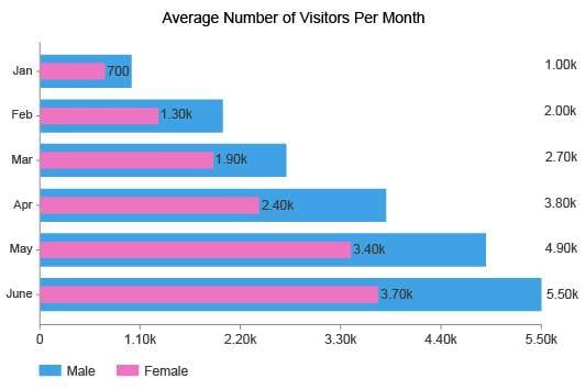
A bar chart is a graphical representation of data that uses rectangular bars to represent different categories or groups. The length or height of each bar is proportional to the value it represents. It is particularly useful for displaying and comparing the frequency, count, or distribution of data across distinct categories.
Typically, the horizontal axis represents the categories, while the vertical axis denotes the numerical values. This visualization tool is effective in providing a clear and straightforward way to interpret data, making it a popular choice in various fields including statistics, economics, and business analytics for its simplicity and ease of understanding.
Types of Bar Chart
Below, you'll find a selection of highly favored bar chart styles widely employed across diverse industries:
- Vertical Bar Chart: A vertical bar chart displays data using vertical bars, with each bar representing a category and the height corresponding to the value it represents. It is an effective way to compare values across different categories.
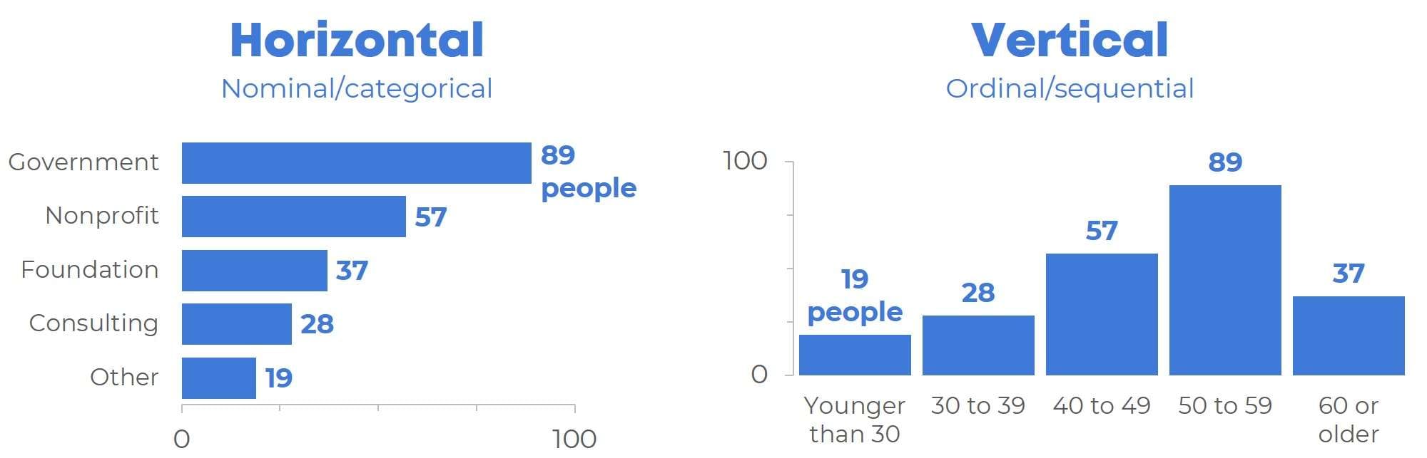
- Horizontal Bar Chart: In a horizontal bar chart, data is represented by horizontal bars. Like its vertical counterpart, it is used for comparing values across categories but is particularly useful when dealing with long category names or limited vertical space.
- GGPlot Bar Chart: The GGPlot bar chart is a versatile and customizable data visualization created using the GGPlot2 package in R. It offers a high degree of flexibility in terms of appearance and is popular among data scientists and statisticians for its powerful plotting capabilities.
- Graph Bar Chart: A graph bar chart, commonly associated with Stata software, is a straightforward method for visualizing categorical data. It provides a clear representation of the distribution or frequency of variables, aiding in data interpretation and analysis.
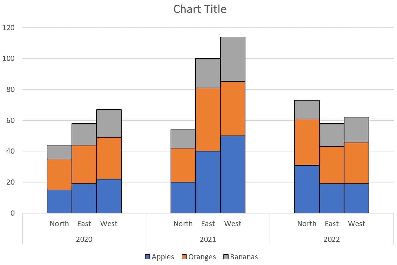
- Stacked Bar Chart: A stacked bar chart displays multiple data sets as stacked bars, allowing for a visual comparison of the total values across categories, as well as the individual contributions of each sub-category. It's useful for illustrating the composition of data.
- PowerBi Bar Chart: Power BI, a business analytics tool by Microsoft, offers a robust bar chart feature. It enables users to create dynamic and interactive visualizations, making it a popular choice for professionals and organizations for reporting and data analysis purposes.
- Overlapping Bar Chart: An overlapping bar chart, also known as a clustered bar chart, is a type of data visualization that displays multiple sets of data side by side within the same category. Each set is represented by a group of bars, and the bars within each group are overlapped, allowing for direct visual comparison between the different sets.
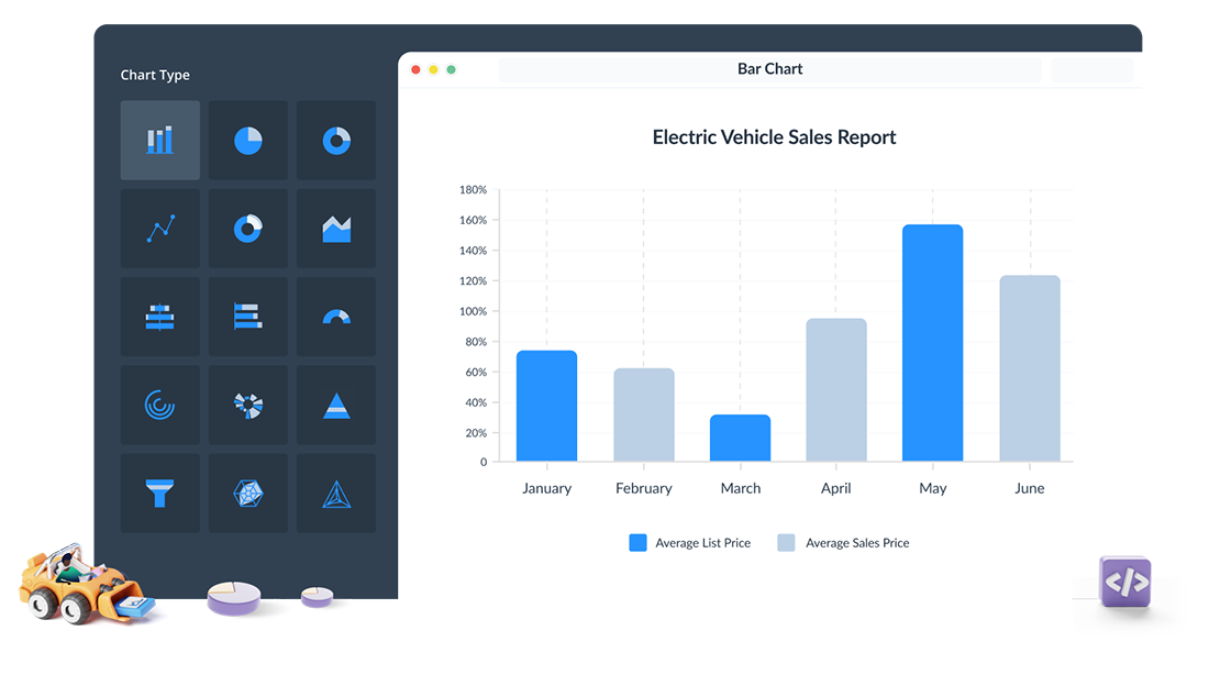
How to Create a Bar Chart with EdrawMax
Well, you will be amazed to know that Wondershare EdrawMax streamlines the process of creating bar charts through its intuitive interface and robust features. It provides a user-friendly platform where users can easily select the desired chart type, including vertical, horizontal, and grouped bar charts. The software offers a wide range of pre-designed templates and customizable elements, allowing for quick and effortless chart creation.
Here are the steps to create a bar chart using EdrawMax:
Step 1: Begin by opening EdrawMax on your computer or device. If you don't have EdrawMax installed, you can download and install it from the official website.
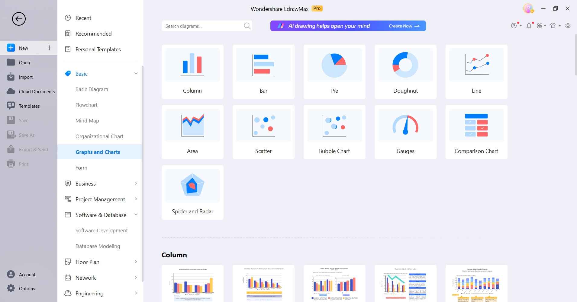
Step 2: Once EdrawMax is launched, navigate to the template gallery, which offers a wide range of professionally designed templates. Look for the category labeled "Bar Charts" and choose a template that best fits the style and purpose of your data visualization.
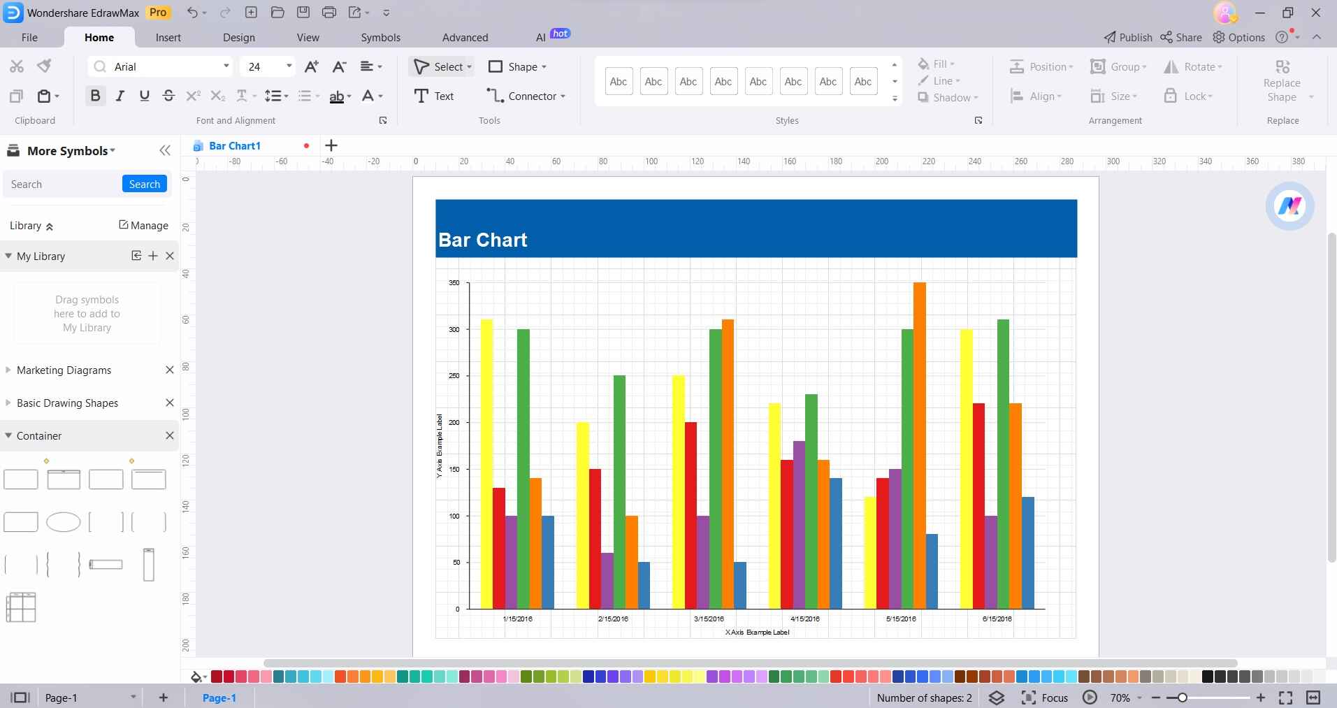
Step 3: Double-click on the chart within the template to access the data editing interface. Here, you can input your own data directly into the provided table.
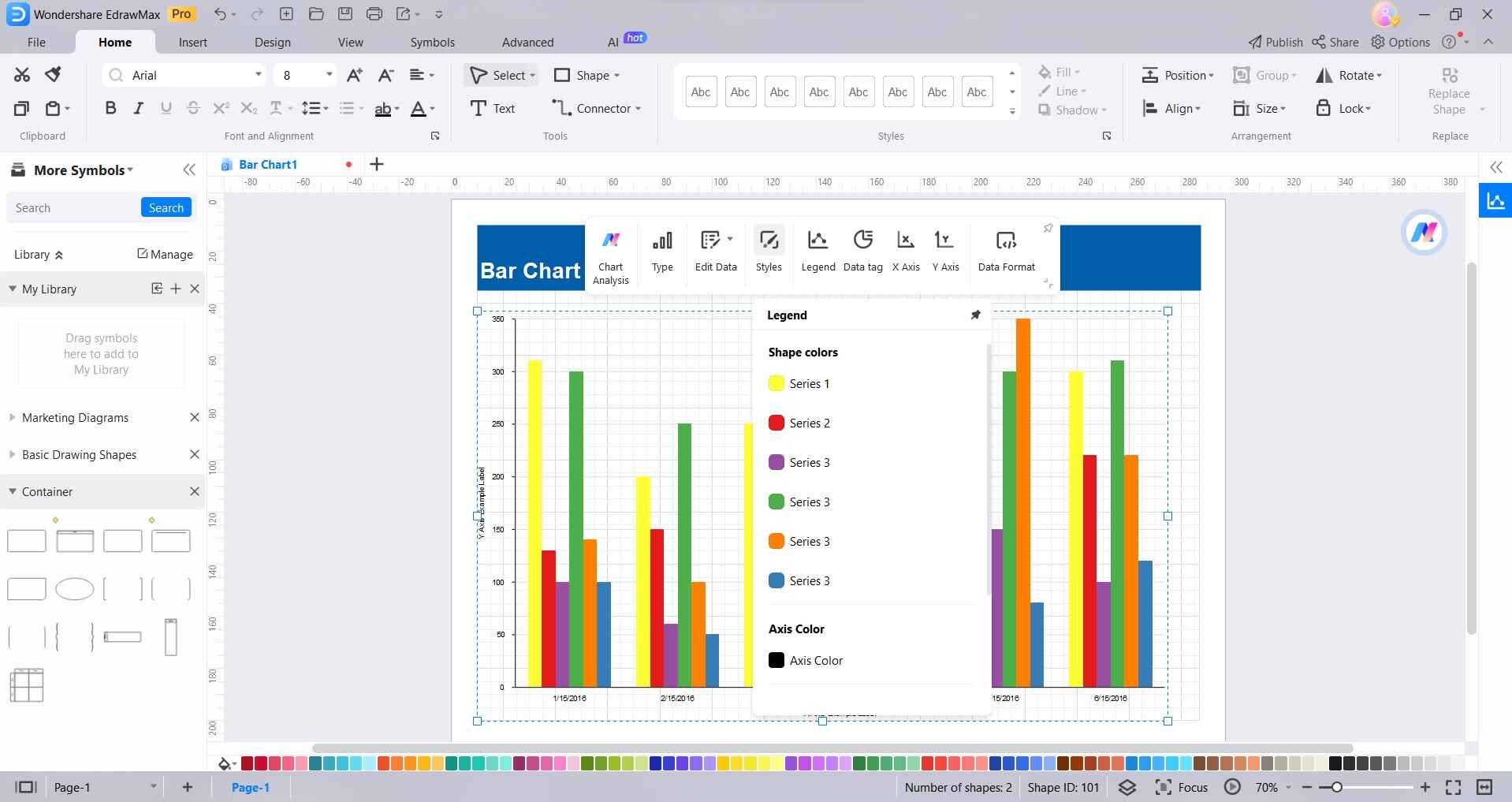
Step 4: To give your bar chart a distinct look, customize its appearance. You can adjust various elements, such as the colors of the bars, background, and text. EdrawMax provides a user-friendly interface for making these adjustments, allowing you to fine-tune the visual aspects of your chart.
Step 5: Enhance the clarity and context of your chart by incorporating additional elements. These may include a title to provide context, a legend to explain the color-coding, and annotations to highlight specific data points. EdrawMax provides easy-to-use tools for adding and customizing these elements.
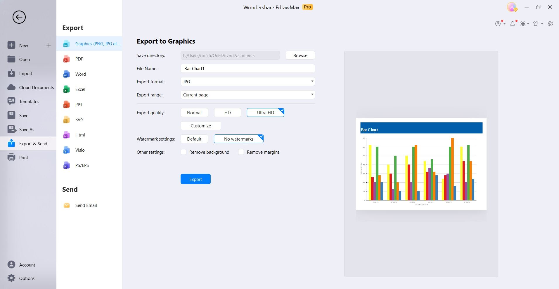
Step 6: Once your chart is finalized, export it to your desired platform or application. You can use the chart in presentations, reports, documents, or any other medium where visual data representation is needed. EdrawMax makes it easy to export your chart in formats compatible with various software and platforms.
Best DFD Tools to Create Bar Charts
Choosing the right tool for creating Data Flow Diagrams (DFDs) and bar charts is crucial for effective data visualization. Here, we've highlighted three top-notch options known for their user-friendly interfaces and robust features:
#1 Wondershare EdrawMax
Wondershare EdrawMax stands out as an exceptional DFD tool for creating bar charts, offering a user-friendly interface and a wide range of customizable templates. Its intuitive features make it a top choice for professionals seeking seamless data visualization.
#2 Canva
Canva, known for its versatility in graphic design, extends its capabilities to creating bar charts. With a user-friendly drag-and-drop interface, Canva empowers users to design visually appealing bar charts with ease, making it a popular choice for individuals and businesses alike.
#3 Visme
Visme is a robust design and data visualization platform that excels in creating dynamic bar charts. With an array of templates and interactive elements, Visme allows users to craft engaging and informative bar charts, making it an excellent choice for presentations, reports, and infographics.
Conclusion
Mastering the art of data visualization through various types of bar charts, including vertical bar charts, dynamic ggplot bar chart variations, graph bar charts, Google bar charts, and PowerBI bar charts, empowers individuals and businesses alike. Each tool offers unique advantages, from the flexibility of ggplot to the user-friendly interfaces of Google and PowerBI.
By leveraging these resources, one can effectively convey complex data, enhancing decision-making and communication. The ability to select the most suitable chart type for specific datasets is a powerful skill that can greatly impact the clarity and effectiveness of data-driven presentations.